CountrPT

CountrPT is an AI-powered career tracking application that helps document employee successes, areas of improvement and overall growth during their career journey.
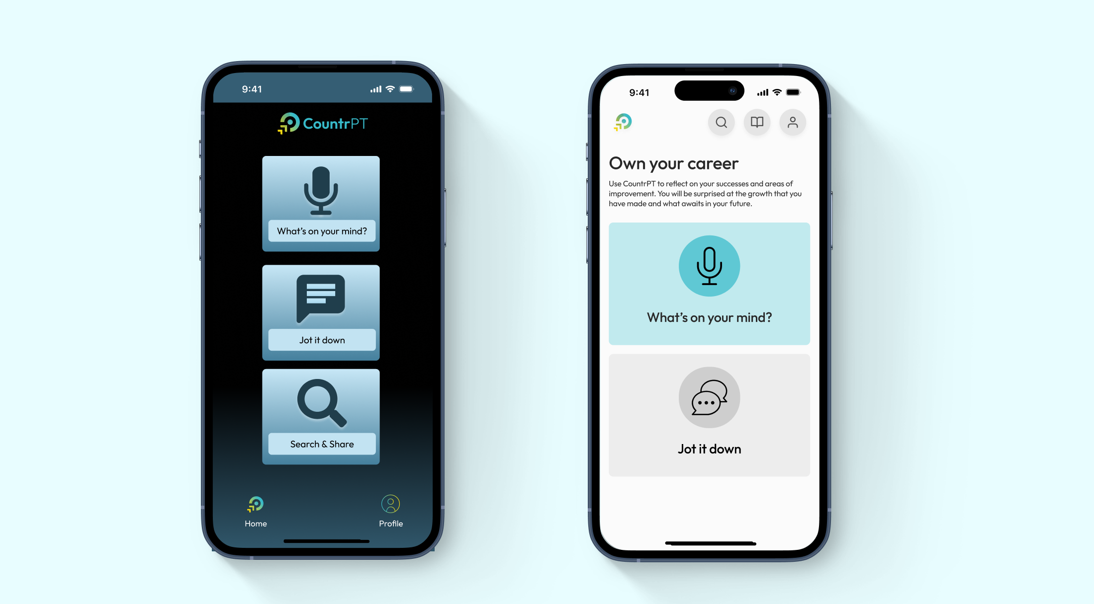
As the stakeholders of CountrPT geared up for their initial release they felt their current MVP interface did not reflect the product potential and innovation that their brand represented. With the help of members at Product Shop Inc., a current-state audit was completed to evaluate the UX and UI of the application. This analysis informed an MVP redesign, incorporating recommendations from the audit and aligning the designs with CountrPT’s branding.
A thorough expert evaluation of the existing designs were needed to identify inconsistencies, accessibility issues, and areas for improvement. This ensured that the new designs not only refreshed the surface level visual design but also improved product usability and reduced friction in the user journey.

Some of the main findings included the following:
- Inconsistent information hierarchy for quick scanning and feature emphases.
- Redundant user flows that could be streamlined for a more efficient experience.
- Missing onboarding and wayfinding elements, making it challenging for users to acclimate to the new product.
- Limited system feedback during journal creation and lack of error prevention to undo and redo submissions.
- Outdated user interface, featuring incorrect UI patterns, excessive use of shadows, and colors that did not align with CountrPT's brand guidelines.

We redesigned CountrPT’s mobile platform to create a seamless and engaging user experience that supports users in their goals. Below are some of the elements we focused on during the redesign:
- Introduced a clear visual hierarchy that prioritized key features and content that aligned with user goals. Proper use of typography, spacing, and headers made important information easily scannable.
- Simplified and consolidate user flows by removing repetitive or unnecessary steps.
- Added undo and redo functionalities to give users more control over their entries.
- We refreshed the UI to align with CountrPT's current brand guidelines and incorporated modern design patterns and cohesive color palette.
In future releases, we will design an interactive onboarding experience that guides new users through the core features of the product.


As this initial MVP required a quick turnaround, I found it still important to think about the long growth ahead. With this in mind, we planned for modularity in the designs, designing for the limited feature set of today while accounting for the growth in opportunities in the future. Below, you can see future iterations of the home screen.

Working with this company has been one of my favorite projects so far. I believe this was an excellent example of how using established UI and UX principles can drastically change the look and feel of a product. While I believe this satisfies the needs for an MVP, there is still more opportunity to develop CountrPT’s brand voice and feature sets within the product. I am excited to see how this product will develop over time and will be making amendments to this case study as we progress.